Seven Iconic Food Packaging Designs.
If the likes of Marilyn Monroe, Jane Birkin and Kate Moss are beauty and style icons, what are the icons for product packaging? Here are 7 of our favourite food packaging designs from the past.

Campbell’s Tomato Soup 1898
Andy Warhol turned this humble can of tomato soup into an iconographic pop art emblem, but did you know its original colours were orange and blue, not red and white? In 1896, Herberton L. Williams, the treasurer and general manager at the time, saw a University of Pennsylvania vs. Cornell football game, and he was impressed by Cornell’s red and white uniforms – and proposed changing the colour scheme of Campbell’s tomato soup. It’s been an eye-catcher ever since.

Coca-Cola’s Glass Bottle 1915
What could be more iconic? Warhol used the shape to represent mass culture, Volkswagen compared the Beatle to the bottle, and Salvadore Dali included a bottle in his 1943 painting Poetry in America. The idea was to design a “bottle so distinct that you would recognize if by feel in the dark or lying broken on the ground.” Over a 100 years later and it still does what it set out to do.

KFC Bucket 1957
It’s been through several makeovers but the bucket always has the same key elements: red, white, and Colonel Sanders. They were the first to think of selling literally buckets of chicken, and now KFC buckets are synonymous with drive-thrus and late nights with family or friends.

Kikkoman Soy Sauce 1961
The man who designed this iconic soy sauce dispenser, Kenji Ekaun lived by this motto: “Design is a source of life enhancement”. This practical yet elegant bottle embodies that principle. It may be a small 150ml bottle, but it has become the face of the brand and for many people, the face of soy sauce itself.

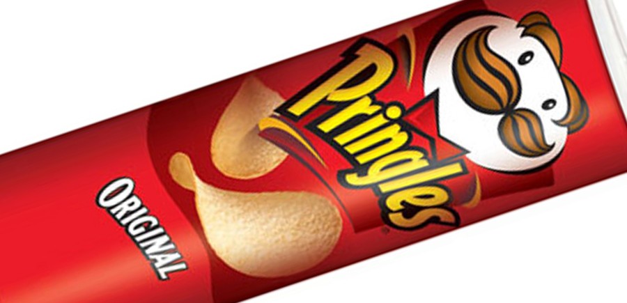
Pringles 1968
A problem solver at heart, the Pringles food packaging was designed to solve the problem of broken chips we find at the bottom of every bag. Heller, the co-chair of the master in fines arts design programme at the School of Visual Arts in New York says, “They changed the way chips were look upon.” Indeed, it’s forever bird’s eye view when it comes to Pringles, and grabbing a chip is easy and orderly.

Heinz Ketchup Squeezable Bottle 1983
The handy squeezable plastic bottle of Heinz ketchup came after the original glass, and now it’s pretty rare to spot a glass bottle of Heinz unless you’re watching a movie featuring an American diner. There is a certain logic to the Heinz octagonal ketchup bottle. The curved neck was designed to encourage the ketchup to flow out smoothly, according to a 2011 book about the design by branding expert Marcel Verhaaf.

Toblerone Praline 1997
This chocolate’s been in the making since 1908, but it wasn’t until 1997 that the Toblerone Praline recipe entered the market, dressed in its most recognizable outfit – the beige packaging. The triangular shape of the chocolate is said to be inspired by the Swiss Alps, in particular the Matterhorn, and it’s been this distinct shape since the very beginning. Now we can’t step into an airport without seeing it in the Duty Free stores!
Please note that we do not claim to own any of the images featured on this page.
