The Low-Down on Creative Food Packaging.
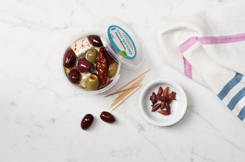
How do you present a jar of marinated olives in such a way that consumers are drawn to it and not the competitor’s? Creative food packaging is about more than being a physical barrier between food and fingers – it’s about presenting a product in a way that makes it stand out from your competitors, engaging the audience’s senses while communicating its unique benefits. It’s about clever branding and promoting, and it’s the kind of problem solving we do daily at Brandhub.

– FROM BRAIN TO PAPER –
So how do we do it? H.U.B is our process for bringing your consumer brand to life. It’s a thorough process designed to define opportunities, respond with brilliant creative solutions that resonate with shoppers, and deliver to your business objectives. H.U.B (Hatch; Unify; Brand).
Hatch.
The first thing we do when presented with a new project is dig. We dig deep to understand your offer, your consumers’ headspace and your world, so we can uncover the truth about your brand. It’s about discovering and distilling your brand’s potential. Our strategists and creatives shop observe, research, hold workshops, ask questions, and importantly, listen to the answers. We distil and analyse the data to develop your optimal position in the market.
Unify.
Once we have uncovered the gold at the heart of your brand, we unify the elements of your unique story, culture, name and visual identity.
Together we create a compelling, totally ownable story that will inform the design style and communicate your key messages.
Brand.
From there, we develop a unique brand design that engages, attracts and communicates with the audience. Successful branding has the power to influence buying patterns, shift perceptions and build loyalty.
Once the design is in the market, we’ll protect your brand’s intellectual property and guide others to do so too.

– WHAT’S HOT? –
Juice, dry spaghetti, gherkins – most edible goods need to be packaged, but with the current state of our planet, unnecessary packaging is becoming increasingly unpopular. Eco-friendly, self-aware types of designs are trending right now, showing us that we can minimise waste while maximising your brand’s potential. So what’s the forecast like for creative food packaging?
Simplicity in Style
This year has been all about simplicity, purity and honesty. Consumers love local products and ones with handcrafted ingredients. Simple packaging is on point for today’s time-pressured consumers who find themselves needing to make decisions on the fly. Paired back, clean and fresh packaging is trending, and it will be much the same in 2018 but with a modern twist.
Transparent and Renewable Material
Brands with nothing to hide resonate well with consumers. With that in mind, we have seen a move towards packaging windows that reveal the product within. What’s different this year is the bold move towards ingenious placement of die cuts which can enhance the brand’s personality when used correctly. Next year we will see more recycled or renewable materials, as well as re-usable or re-fillable containers.
Provincial Imagery
Consumers love to align themselves with products which are grown or produced in environments where the air is fresh, clean, and the ingredients pure or organic. Provincial is so hot right now, and clever use of imagery and fonts help to communicate a rich story to consumers. Beautifully crafted illustrations on food packages have never been so powerful. They have the ability to transport consumers to a time, mood, or a fantasy place and allows them to engage emotionally, immersing themselves in the story of the brand.
Custom Typography
In 2017 we have seen brands stepping out of the box, having fun with fonts and colours, with custom-made fonts being particularly popular. It’s easy to understand why – it creates an authentic look, conveying warmth and a feeling of nostalgia, reminding us of the days when our food was handmade from scratch in a homestead kitchen. In 2018 we expect to see further use of typography to hint at homemade and handcrafted goods.


Please note that we do not claim to own any of the images featured on this page.