WHITE GOLD
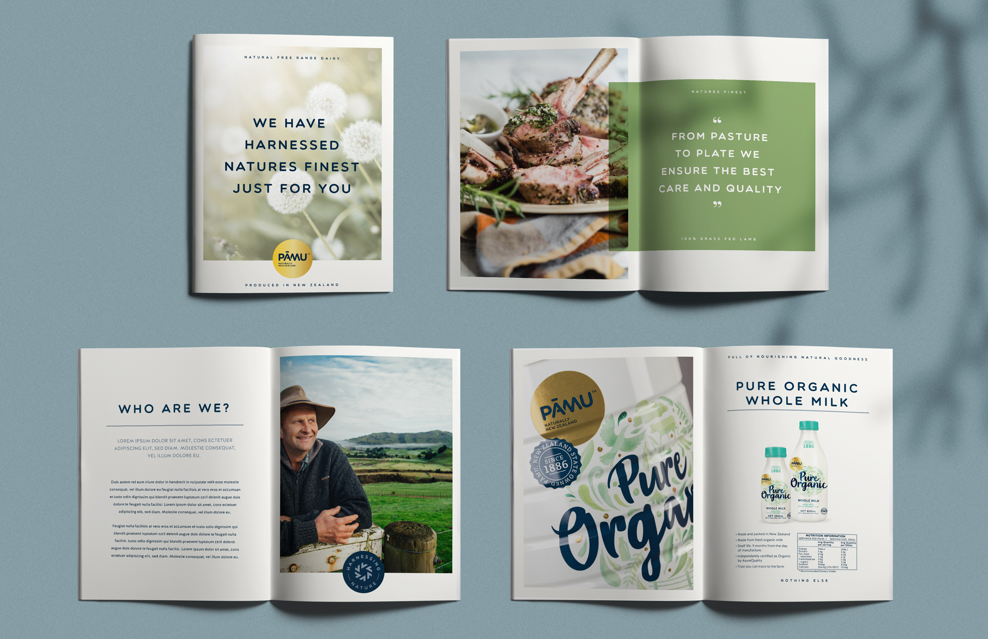
As a brand synonymous with beautiful Kiwi imagery, Pāmu needed striking internal-facing collateral to match. Business cards, memos, agendas, comms slips and letterheads that evoke a ‘fresh’ feeling to match their premium array of products and services. As the creators of many of their packaging designs to date, we were a natural match to translate Pāmu’s vibrant look and premium feel across the brand’s internal comms.
We got our design team to go for gold, resulting in something more than a little special. The collateral uses elements from all the previous work we’ve done for Pāmu, positioning them as ‘Natural Innovators’ – a brand that values quality, purity, and NZ’s world-renowned natural environment. Using colours inspired by lush farmland and rugged bush, as well as photography that shows farming, sheep, milk and nature, our design solution speaks directly to the fact that Pāmu’s products are completely natural and their farms, world class. The gold Pāmu logo also makes a prominent appearance on all design elements, giving the brand a wonderfully luxurious feel.
Naturally, we’re very proud of the results.